Breadcrumbs stylization. Use of lists. Add transparency with border
Lists are convenient due to their hierarchical structure and flexible view settings, therefore they are used not only for their intended purpose, but also for creating various page elements such as breadcrumbs, pagination, menus, tabs, etc.
breadcrumbs
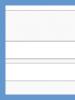
Breadcrumbs help you navigate the site and show the position of the current page relative to other sections of the site. This makes it easy to go up a level and understand which section you are currently in. So, for a technical site, navigation can be as follows (Fig. 1).
Rice. 1. Type of bread crumbs
The last text points to the current page and is not a link. All items are separated from each other by some symbol, usually an arrow (→), a slash (/), a greater than sign (>), and the like.
Since the design is assigned to styles, the HTML code is very concise. We create a list and assign the breadcrumbs class to it so that the style does not spread to other lists.
Note that there are no separators here, they are displayed using the content style property (example 1).
Example 1: Creating Breadcrumbs
To begin with, we reset all the margins and indents of the list and line up the items horizontally through the display property with a value of inline-block . It also removes markers, so you don't need to do it on purpose. The ::before pseudo-element is required to add a separator between items and control its appearance. The text is added to all items, including the first one, which of course we don't need. Therefore, we remove it with the :first-child pseudo-class, which applies the style to the first element
A large number of materials, such as site articles, are often divided into separate pages with 10-15 articles per page, which leads to a reduction in site load. The transition between individual pages is done through their numbering, where each number serves as a link to the corresponding page. It is possible to display all pages, a certain number of them, or only links to the next and previous page. Which option to choose depends on the design of the site and your preferences. One of possible ways numbering is shown in fig. 2.

Rice. 2. Pagination
To do this numbering, we again use a simple list, now with the pager class, each item of this list will be a link to the page. To highlight the current page, let's add the active class (example 2).
Example 2: Pagination
- 1
- 2
- 3
- 4
- 5
- 6
The line between the items is done through the border-bottom property on the element
- . Because the
- And (example 3). They fit snugly together and create the effect of a single strip.
Example 3. Horizontal menu
Menu The gradient in this example is added using the linear-gradient function, and the shadow is added using the box-shadow property.
Dropdown menu
A more complex type of menu is called a drop-down menu. When you hover the pointer over the items, a submenu appears, previously invisible (Fig. 4); as soon as the pointer moves away from the text, the menu hides again.

Rice. 4. Drop down menu view
This type of menu is quite complicated for layout, so let's analyze it in more detail. First, we make a nested list - the items of the first list serve as the text of the main menu, the second list is inside the element
- will serve as a submenu. If the submenu is not required, then leave only one element
- , A
- do not add to it. The structure of each item is as follows.
- Russian kitchen
- beef stroganoff
- Goose with apples
- Krupenik Novgorod
- Crayfish in Russian
- to set the style for the first and second level menu items. If you just specify the li selector, then the style will be applied to all items in general. So we use the .menu > li selector, it only applies the style to the elements
- first level. As a result, the style for our horizontal menu changes a bit.
/* Zero padding and remove markers from lists */ .menu, .menu ul ( list-style: none; margin: 0; padding: 0; ) .menu ( background: linear-gradient(to bottom, #fff, #f1f2f2 ); /* Gradient */ border: 1px solid #999; /* Border options */ padding: 0 5px; /* Margins */ font: 14px Arial, sans-serif; /* Font options */ box-shadow: 0 2px 5px rgba(0,0,0,0.2); /* Menu shadow */ ) .menu > li ( display: inline-block; /* Line up horizontally */ border-right: 1px solid #fff; /* White line on the right */ position: relative; /* Relative positioning */ ) .menu a ( text-decoration: none; /* Remove underlining */ color: #4c4c4c; /* Link color */ display: block; /* Block links */ ) .menu > li > a ( padding: 10px 15px; /* Margins */ border-right: 1px solid #d8d8d8; /* Right gray line */ position: relative; /* Relative positioning */ z-index : 3; /* Draw on top of other elements */ ) .menu ul ( display: none; /* Hide the submenu */ )
We hide the submenu through the display property, as a result, the menu should look like shown in Fig. 3. Also added zero values for lists, this will be useful to us when adding sub-items, plus relative positioning is involved, z-index will not work without it. And we need it for the correct imposition of some elements on top of others.
You can temporarily enable the display of submenus and customize their appearance.
Menu ul ( position: absolute; /* Absolute positioning */ display: none; /* Hide the submenu */ width: 200px; /* Submenu width */ background: #fff; /* Background color */ box-shadow: 0 0 10px #666; /* Shadow options */ ) .menu ul a ( padding: 5px 10px; /* Margins */ ) .menu ul a:hover ( background: #008df2; /* Background color */ color: #fff; /* Text color */ )
It remains to display the submenu when hovering the mouse over the menu items. To do this, we use the :hover pseudo-class, adding it to li.
Menu li:hover ul ( display: block; )
This selector says that the style should be applied to the element.
- , in this case only display it when the mouse pointer is over the element
- inside a container with class menu .
After that, our menu will work and display the submenu where it is available. There are the last decorative touches related to the shadows and their correct overlay. To correctly display the shadow below the first level menu items, create an empty pseudo-element via ::before , set a shadow for it, and put it under the link (here is the z-index for and useful).
Menu > li:hover::before ( content: ""; /* Create empty pseudo-element */ top: 0; left: 0; right: 0; bottom: 0; /* Same size as menu item */ box-shadow: 0 5px 10px #666; /* Shadow options */ position: absolute; /* Absolute positioning */ )
The final code is shown in example 4.
Example 4 - Dropdown menu
Menu Greetings. Breadcrumbs are quite a useful block on any website because it allows you to see the full path to the page you are currently on. And today I will tell you how to style breadcrumbs in css? Not to create, namely to arrange. In general, there are many options, I will touch on two.
A simple design option - without a picture
The html code mimics breadcrumbs. Let it be like this:
In principle, you can just put down an angle bracket, but then there will be no way to control the thickness of the line. I propose to do it differently, with the help of transformations. Here is the code that will do it:
Cumbs1 a:not(:last-child):after(
content: "";
display: inline-block
width: 5px
height: 5px;
border-top: 2px solid black;
border-right: 2px solid black;
transform: rotate(45deg);
margin-left: 5px
}
.cumbs1 a:hover(
color: orange;
}Perhaps for you it will be complicated selectors, then check out this article. The bottom line is this: using the pseudo-element (about what it is and how to use - ) after adds our separator to the end of each link. It is formed using two frames and rotated 45 degrees. We also add an orange color to the hover links. Here, in principle, and all the design.
Another design option - with a picture
In this case, the breadcrumbs will look more interesting, like this:
To do this, we need an image and some css styles:Cumbs2(
background: orange;
max-width: 250px
}
.cumbs2 a(
display: inline-block
padding: 7px 0
color: #000;
}
.cumbs2 a:not(:last-child)(
background: url(arrow.png) no-repeat 100% 50%;
padding-right: 33px;
}html code I do not quote, because it is the same as in the first case. Where to start here? First, we define the background color and size of the entire block with breadcrumbs. Next, we set the general styles for links - block-inline type, indentation at the top and bottom, and color.
The next step is the most interesting - using the not pseudo-class, select all links in the block, except for the last one, and set a background image for them arrow.png , without repetition, with the background position in the middle in height and at the very end in the width of one link. The first two links need the inner indent on the right just to place the picture there. If it weren't there, the picture would run into the text.
How the not pseudo-class works, I think you have already guessed - it selects all elements, except for what is indicated in brackets. If anything, in the future I will write another short note about working with the pseudo-class:not , where everything will be more clear. Well, here are 2 simple breadcrumb designs that you can use to make your own.
In this tutorial, you'll learn how to create breadcrumbs in Bootstrap 3 and 4.
Breadcrumbs markup
Navigation chains ("breadcrumbs", breadcrumbs) is a navigation scheme that shows the current position of the user on the site. They are used to display hierarchically organized information. For example, in an online store, breadcrumbs are usually chained sections. With their help, the user can determine which section he is currently in, and they also allow you to go to sections of higher levels, i.e. provide another way to navigate the site structure.
Breadcrumbs in Bootstrap are simply ordered lists with class breadcrumbs . The list separator is automatically added with CSS (bootstrap.min.css) via the following class:
Breadcrumbs > li + li:before ( color: #cccccc; content: "/"; padding: 0 5px; )
Breadcrumb example with Bootstrap.
Styling Breadcrumbs in BootstrapOne more example:
Breadcrumbs for navigating archived informationNon-standard breadcrumbs design
Consider an example of creating the following breadcrumb design option:
An example of the design of bread crumbs on the site
The process of creating breadcrumbs consists of developing HTML structure and styles (CSS).
Breadcrumb CSS:
/* breadcrumbs */ #breadcrumb ( list-style: none; display: inline-block; padding-left: 0px; ) #breadcrumb .icon ( font-size: 14px; ) #breadcrumb li ( float: left; ) # breadcrumb li a ( color: #fff; display: block; background: #cc2eaa; text-decoration: none; position: relative; height: 34px; line-height: 34px; padding: 0 10px 0 5px; text-align: center ; margin-right: 23px; -webkit-user-select: none; -moz-user-select: none; -ms-user-select: none; user-select: none; ) #breadcrumb li:first-child a ( padding-left: 15px; -moz-border-radius: 4px 0 0 4px; -webkit-border-radius: 4px; border-radius: 4px 0 0 4px; ) #breadcrumb li:first-child a:before ( border: none; ) #breadcrumb li:last-child a ( padding-right: 15px; -moz-border-radius: 0 4px 4px 0; -webkit-border-radius: 0; border-radius: 0 4px 4px 0; ) # breadcrumb li:last-child a:after ( border: none; ) #breadcrumb li a:before, #breadcrumb li a:after ( content: ""; position: absolute; top: 0; border: 0 solid #cc2eaa; border-width: 17px 10px; width: 0; height: 0; ) #breadcrumb li a:before ( left: -20px; border-left-color: transparent; ) #breadcrumb li a:after ( left: 100%; border-color: transparent; border-left-color: #cc2eaa; ) #breadcrumb li a:hover ( background-color: #a22587; ) #breadcrumb li a:hover:before ( border-color: #a22587; border-left-color: transparent; ) #breadcrumb li a:hover:after ( border -left-color: #a22587; ) #breadcrumb li a:active ( background-color: #a22587; ) #breadcrumb li a:active:before ( border-color: #a22587; border-left-color: transparent; ) # breadcrumb li a:active:after ( border-left-color: #a22587; ) #breadcrumb li. current a ( pointer-events: none; cursor: not-allowed; filter: alpha(opacity=65); -webkit-box -shadow: none; box-shadow: none; opacity: .65; )
Color changes are made by editing the values of the corresponding CSS properties.
HTML markup:
Maintaining the current element (if it will be used in a chain) is done by adding the current class to the li element.
Breadcrumb navigation helps site visitors navigate the hierarchical structure of documents and find their way to the top level. Therefore, if a large number of documents are placed on the site, then it must be provided with "breadcrumbs". In this tutorial, you will be presented with CSS code for creating various design options for such a desired navigation tool.
HTML markup
The markup is simple and minimal. It is based on an unordered list.
css
First, let's do a little CSS reset on our unordered list:
Ul( margin: 0; padding: 0; list-style: none; )
Pseudo-elements will be used to design our breadcrumbs.
First example
This example uses a very simple technique. A triangle is created on the frame on the right using pseudo-elements placed one above the other. The dark triangle is shifted to create a border effect.

#breadcrumbs-one( background: #eee; border-width: 1px; border-style: solid; border-color: #f5f5f5 #e5e5e5 #ccc; border-radius: 5px; box-shadow: 0 0 2px rgba(0, 0,0,.2); overflow: hidden; width: 100%; ) #breadcrumbs-one li( float: left; ) #breadcrumbs-one a( padding: .7em 1em .7em 2em; float: left; text- decoration: none; color: #444; position: relative; text-shadow: 0 1px 0 rgba(255,255,255,.5); background-color: #ddd; background-image: linear-gradient(to right, #f5f5f5, # ddd); ) #breadcrumbs-one li:first-child a( padding-left: 1em; border-radius: 5px 0 0 5px; ) #breadcrumbs-one a:hover( background: #fff; ) #breadcrumbs-one a ::after, #breadcrumbs-one a::before( content: ""; position: absolute; top: 50%; margin-top: -1.5em; border-top: 1.5em solid transparent; border-bottom: 1.5em solid transparent; border-left: 1em solid; right: -1em; ) #breadcrumbs-one a::after( z-index: 2; border-left-color: #ddd; ) #breadcrumbs-one a::before( border-left-color: #ccc;right: -1.1em; z-index: 1; ) #breadcrumbs-one a:hover::after( border-left-color: #fff; ) #breadcrumbs-one .current, #breadcrumbs-one .current:hover( font-weight: bold; background: none; ) # breadcrumbs-one .current::after, #breadcrumbs-one .current::before( content: normal; )
CSS shapes are built with pseudo-elements placed before and after an element.

#breadcrumbs-two( overflow: hidden; width: 100%; ) #breadcrumbs-two li( float: left; margin: 0 .5em 0 1em; ) #breadcrumbs-two a( background: #ddd; padding: .7em 1em ; float: left; text-decoration: none; color: #444; text-shadow: 0 1px 0 rgba(255,255,255,.5); position: relative; ) #breadcrumbs-two a:hover( background: #99db76; ) #breadcrumbs-two a::before( content: ""; position: absolute; top: 50%; margin-top: -1.5em; border-width: 1.5em 0 1.5em 1em; border-style: solid; border- color: #ddd #ddd #ddd transparent; left: -1em; ) #breadcrumbs-two a:hover::before( border-color: #99db76 #99db76 #99db76 transparent; ) #breadcrumbs-two a::after( content : ""; position: absolute; top: 50%; margin-top: -1.5em; border-top: 1.5em solid transparent; border-bottom: 1.5em solid transparent; border-left: 1em solid #ddd; right: -1em; ) #breadcrumbs-two a:hover::after( border-left-color: #99db76; ) #breadcrumbs-two .current, #breadcrumbs-two .current:hover( font-weight: bold; background: none; ) #breadcrumbs-two .current::after, #breadcrumbs-two .current::before( content: normal; )
The border-radius property rounds the corners of rectangles and squares. The square turns to make a diamond out of it.

#breadcrumbs-three( overflow: hidden; width: 100%; ) #breadcrumbs-three li( float: left; margin: 0 2em 0 0; ) #breadcrumbs-three a( padding: .7em 1em .7em 2em; float: left; text-decoration: none; color: #444; background: #ddd; position: relative; z-index: 1; text-shadow: 0 1px 0 rgba(255,255,255,.5); border-radius: .4em 0 0 .4em; ) #breadcrumbs-three a:hover( background: #abe0ef; ) #breadcrumbs-three a::after( background: #ddd; content: ""; height: 2.5em; margin-top: -1.25em ; position: absolute; right: -1em; top: 50%; width: 2.5em; z-index: -1; transform: rotate(45deg); border-radius: .4em; ) #breadcrumbs-three a:hover: :after( background: #abe0ef; ) #breadcrumbs-three .current, #breadcrumbs-three .current:hover( font-weight: bold; background: none; ) #breadcrumbs-three .current::after( content: normal; )
Two rectangles are added using pseudo-elements. Then they round the corners.

#breadcrumbs-four( overflow: hidden; width: 100%; ) #breadcrumbs-four li( float: left; margin: 0 .5em 0 1em; ) #breadcrumbs-four a( background: #ddd; padding: .7em 1em ; float: left; text-decoration: none; color: #444; text-shadow: 0 1px 0 rgba(255,255,255,.5); position: relative; ) #breadcrumbs-four a:hover( background: #efc9ab; ) #breadcrumbs-four a::before, #breadcrumbs-four a::after( content:""; position:absolute; top: 0; bottom: 0; width: 1em; background: #ddd; transform: skew(-10deg ); ) #breadcrumbs-four a::before( left: -.5em; border-radius: 5px 0 0 5px; ) #breadcrumbs-four a:hover::before( background: #efc9ab; ) #breadcrumbs-four a ::after( right: -.5em; border-radius: 0 5px 5px 0; ) #breadcrumbs-four a:hover::after( background: #efc9ab; ) #breadcrumbs-four .current, #breadcrumbs-four .current :hover( font-weight: bold; background: none; ) #breadcrumbs-four .current::after, #breadcrumbs-four .current::before( content: normal; )
Benefits of CSS3 Breadcrumb Design
- No images, so just update and maintain.
- Easy to scale.
- Backward compatible with older browsers.
The previous article “Navigating breadcrumbs with triangles in CSS” described how to create a menu with pure CSS, without the use of graphics.
The method is good for everyone, except for one thing - support for such a menu in older browsers is doubtful. But when translating this article, a link was mentioned to a way to create navigation using graphics.
The article was written a long time ago, but the method is absolutely working. The author of the article is Veerle Pieters, and the post itself is called “Simple scalable CSS based breadcrumbs”. Below I give not even a free translation of it, but a free retelling.
A few days ago, I had the task of creating a breadcrumbs-style navigation menu for a site I was working on. I don't think that such a menu is necessary for every site, but in some cases it is very useful and practical.
However, this example is, as it were, a basis that can be expanded and applied in practice. The menu will be created using a regular bulleted list
.1 ul But first, let's look at the sample we'll be working with:
The menu is quite simple, as is the code with which we will create it.
HTML code - bulleted list ul
- Home
- Main section
- sub section
- Sub sub section
- The page you are on right now
All menu items have links, except for the last one - “The page you are on right now” (The page you are on right now). While working on the menu, I wondered - is the list the most appropriate structure for creating a menu? I believe that using a list in this case is not a strict rule, but it seems to me that this is the most semantic and correct option.
CSS code - creating styles for the menu
We set general styles for the menu - remove markers and reset indents in Firefox, IE browsers:
make floating through the property equal to the height of the entire menu - . And set the text color. Next, we place a background image cut from the layout for the link. To do this, you need to cut out only the “arrow” itself:… which we “push” to the right (100%) and place exactly vertically (50%). We also indent the link to the right
, which will contain the background image (the cut arrow): .crumbs li a ( display : block ; padding : 0 15px 0 0 ; background : url(img/crumbs.gif) 100% 50% no-repeat ; )1 padding-left: 15px Almost everything has already been done. It remains to set styles for the link text. Remove the standard underline and change its color:
.crumbs li a :link , .crumbs li a :visited ( text-decoration : none ; color : #777 ; )
And1 :hover
. When hovering the mouse or receiving keyboard focus, the color of the link text will change: .crumbs li a :hover , .crumbs li a :focus ( color : #dd2c0d ; )1 :focus The result of our work is presented here:
Translator's note:
The author of the article simplified the example as much as possible and the code itself, respectively, as far as I understand. The fact is that the linear horizontal gradient for each of the menu items is clearly visible in the example. However, this was not shown in the code. Well, it doesn't matter - is it really a problem to create a linear gradient in CSS3? The task itself is done!
- inside a container with class menu .
Now we need to distinguish the style for different elements
- is a block element and takes up all the width available to it, it must be limited either by setting width , or, as shown in the example, by setting display with a value of inline-block . The line is under the numbers, so the menu items are shifted down by half their height.
The sizes of all circles are set exactly, through width and height , and therefore there are two problems. The first is that the link is much smaller than the circle itself and the user will miss; the second - the link is located at the top of the circle, but not in its middle. The first problem is solved simply - you need to make the links block, then they will occupy the entire width and height of the circle. At the same time, the links remain square and slightly go beyond the colored background. But this is not visible and becomes noticeable only when you hover over one of the corners of the link. Text alignment is done using the line-height property, whose value is the same as the height of the element. This method allows you to align the text to the middle of the height of the element and it will be useful to us in the future.
Menu creation
The menu on the site is one of the ways to navigate through it. The simplest option is a set of horizontal links that look like breadcrumbs. The difference is that there are no pointers between the links (Fig. 3).

Rice. 3. Horizontal menu
To create such a menu, we apply the principles we used in the previous examples, but for a change, we will make decorative changes. The menu has a slight gradient, there is a faint shadow below it, and the menu items are separated by a vertical line. The line itself is non-standard and consists of gray and white stripes, so we will separately add our own line to the elements